I designed an app aimed at helping women track their menstrual cycle and health changes. The project involved a comprehensive design process, from research and analysis to prototyping and testing.
Overall, this project was additional practice for me - to take a product from ideation to execution, using a rigorous design process to identify and solve user problems, and creating a cohesive and engaging user experience.
To begin, I conducted extensive research on the target audience and their needs, using a combination of user interviews, surveys, and secondary sources. Based on this research, I defined the target audience and mapped out the current customer journey, identifying pain points and areas for improvement.
Using this information, I began to develop solutions for each of the identified problems, with a focus on creating a user-friendly and intuitive interface that would allow users to easily track and manage their menstrual cycle and health data. This included developing a user flow that would guide users through the app's features and functionalities, as well as a design system that would ensure consistency and coherence throughout the user experience.
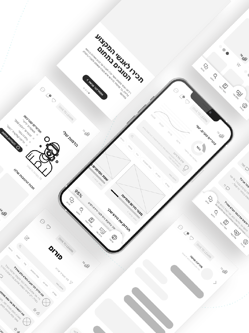
Once the user flow and design system were established, I moved on to creating prototypes, using a combination of wireframes, high-fidelity mockups, and interactive prototypes to test and refine the app's design. This process involved multiple rounds of user testing and feedback, which allowed me to fine-tune the app's features and improve the user experience.
Color Scheme
Colors were chosen to reflect different moods of a women on the monthly cycle basis. On the same time I tried to avoid pink colors, as a color that considered to be cliche and associated with babies as well. Red and Green colors are meant to represent positive or negative feedback, while main application is plain and full of white.
Typography
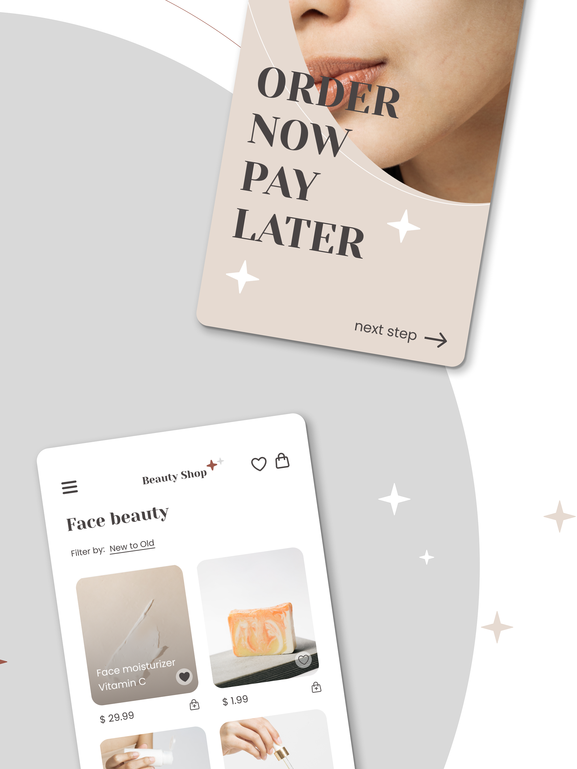
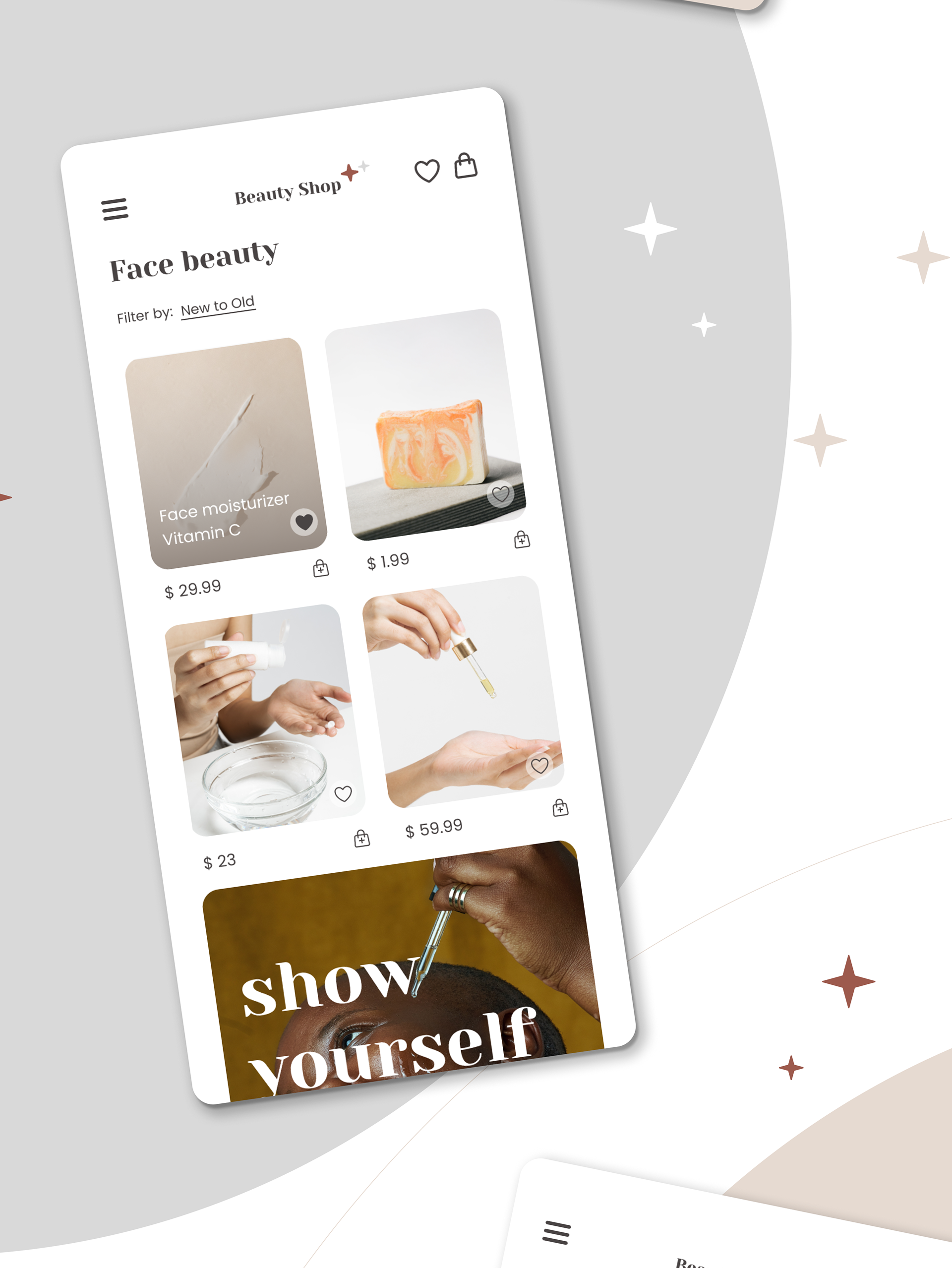
The font styles were based on the main theme and target audience of the application - women. The main purpose was to chose font that is playful, positive, quiet round, but not childish. I have stopped on Poppins, of Google Fonts library. Poppins provides various different weights, which was perfect for my purpose.
Mockups
The mockups were made within 2 days with iterations.
Playable Prototype
Try it yourself!
