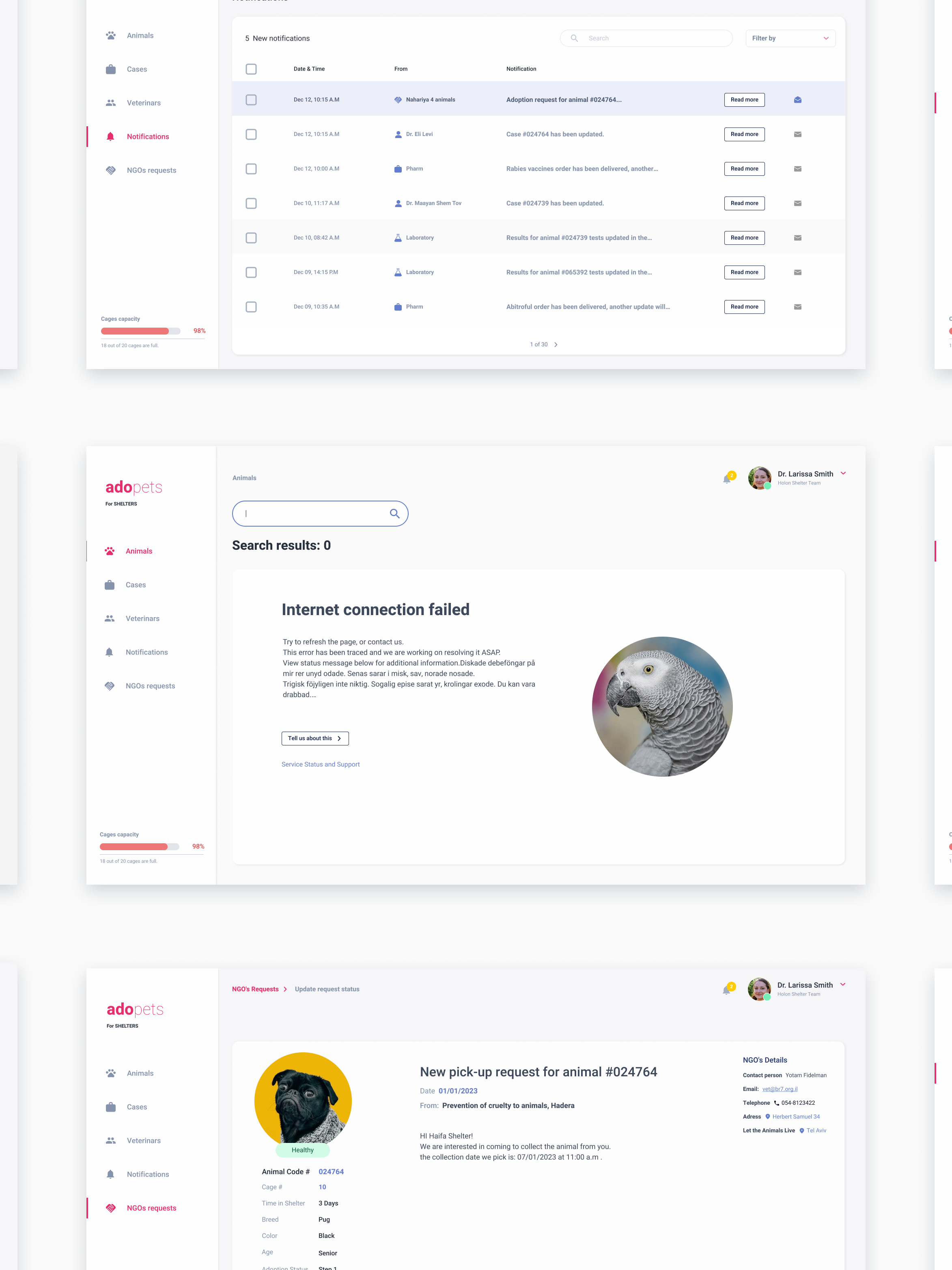
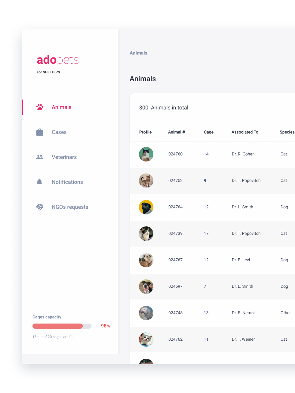
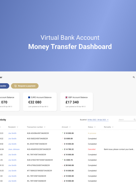
Web and UI/UX design of landing page for a POS (point of sale) system developed specifically for restaurants and few screen of application itself. The system is designed to optimize the order-taking process, help manage waitstaff workflow, and streamline payment processing for clients.
The landing page was created using Figma, and was designed with a focus on marketing the features and benefits of the POS system.
As part of this project, I designed several screens for the POS application to give potential clients a clear understanding of the system's ease of use.
The page includes clear and concise information about the product, a visually appealing design, and strong calls to action that encourage visitors to learn more and potentially purchase the system.
