Overview
The brief was to create in a short time a first draft of the dashboard design of the virtual bank assistant desktop application for the Fibonatix company. The application is designed for merchants and offers features for bank transactions and payments.
The process
1. Research and analysis
2. User flows, Wireframes and design system
3. Final Design
Day 1 - Research & UX Startegy
To begin the project, I conducted thorough research on the target audience and their needs, as well as gathering references and best practices from similar products in the industry.
User Flows
Based on this research, I developed a user flow and defined a job-to-be-done statement, which helped guide the design process and ensure that the final product would meet the needs of users.
Competitive analysis
The analysis of competitors was based on the main service that the bank is providing - online bank transfer and overseas currency exchange.
In my research and analysis I have focused on user's needs and options, that are provided by the main competitors on their main dashboard pages.
Additionally I have reviewed Fibonatix website to create brand design system, to keep consistency across the company's products.
Day 2 - Design system & Wireframes
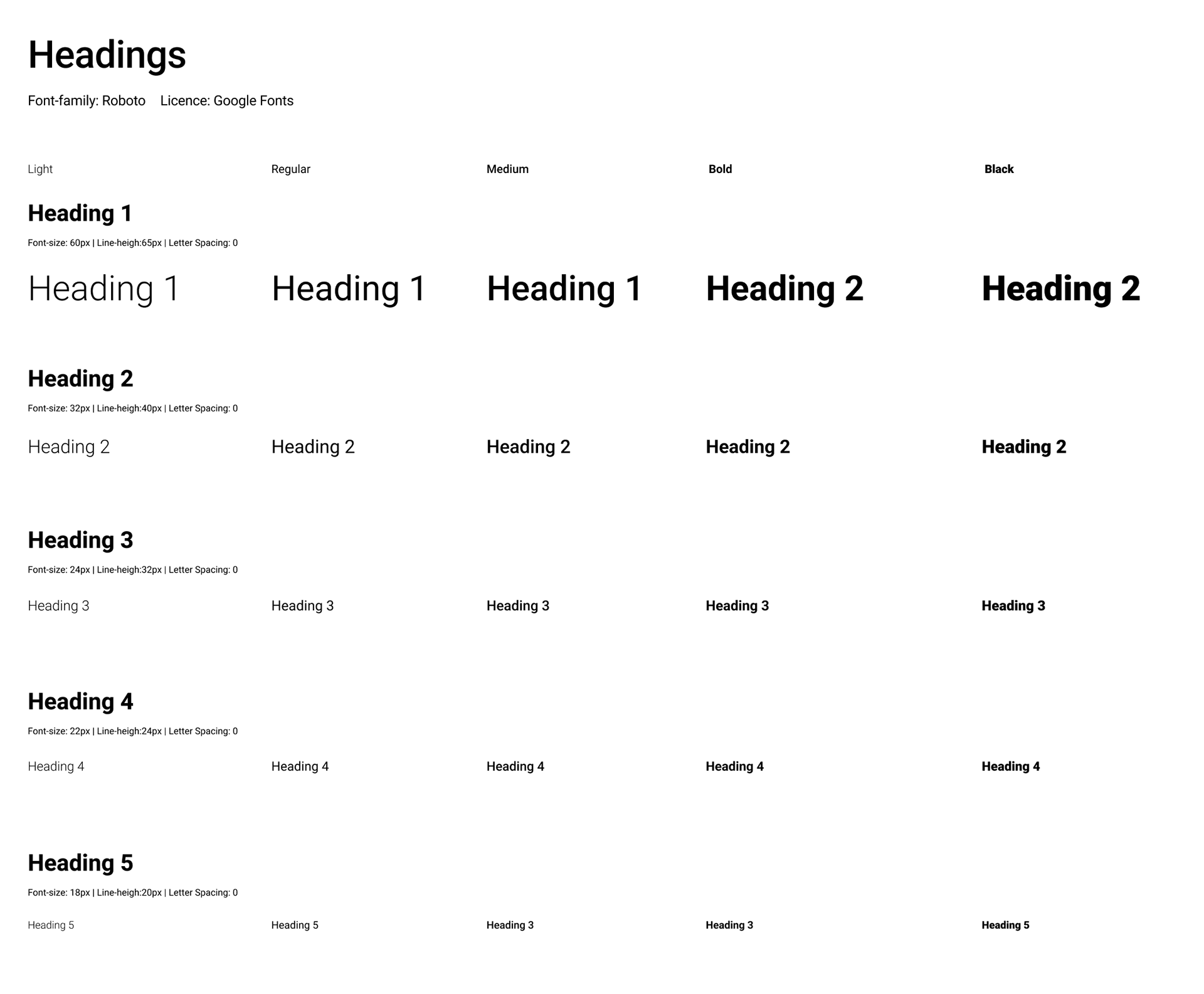
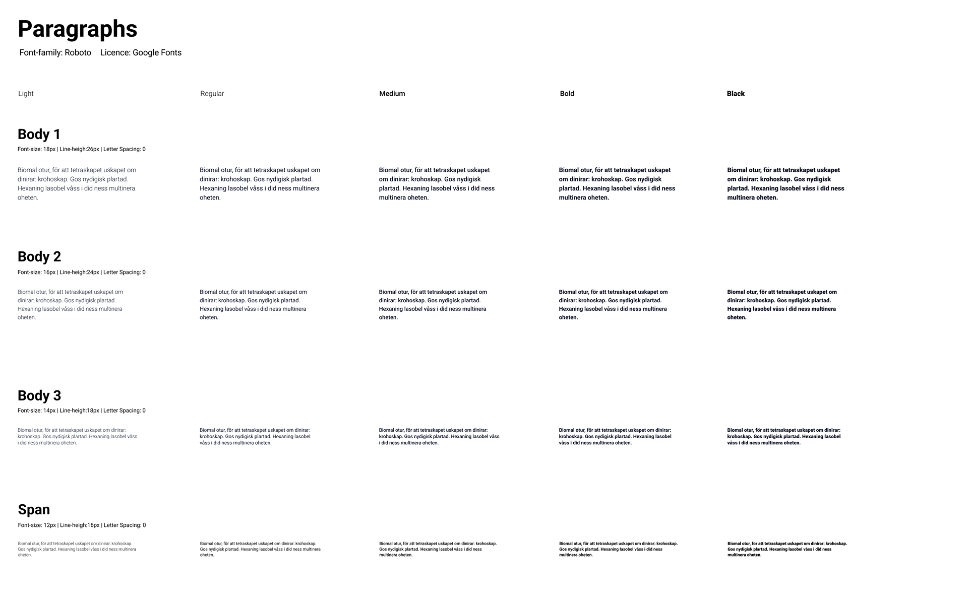
Using the user flow and job-to-be-done statement as a foundation, I began developing a design system that would ensure consistency and coherence throughout the user experience. This included selecting appropriate fonts, colors, and other design elements that would align with the overall branding of the product.
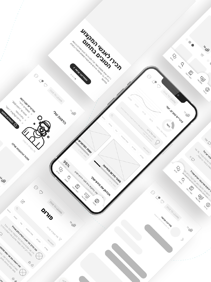
Once the design system was established, I moved on to creating the final design for the dashboard screen. This involved creating wireframes, high-fidelity mockups, and interactive prototypes, which were tested and refined through multiple rounds of user feedback.
Wireframe
Day 3 - Final UI
Overall, this project demonstrated my ability to take a complex product and distill it into a clear and user-friendly interface. Through a rigorous design process that included research, user testing, and careful attention to detail, I was able to create a dashboard screen that met the needs of merchants and provided a seamless experience for bank transactions and payments.
