Type of the project: Mobile App
Client: CerebralFix Limited / Te Ara Pounamu Limited
Duration: 4 month
Product Link
Client: CerebralFix Limited / Te Ara Pounamu Limited
Duration: 4 month
Product Link
About
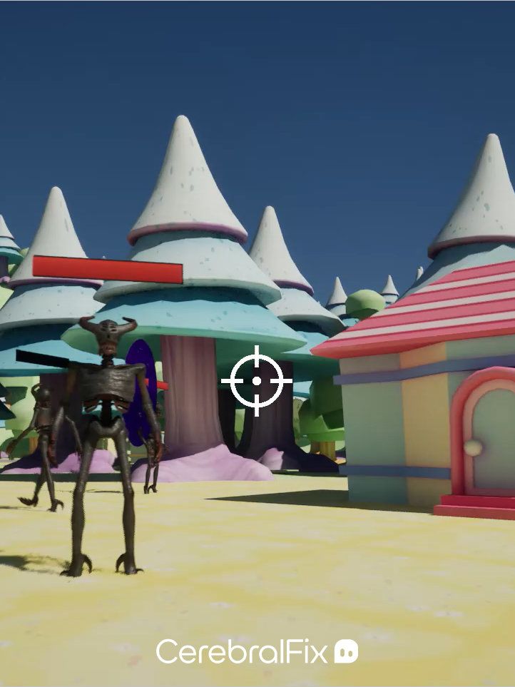
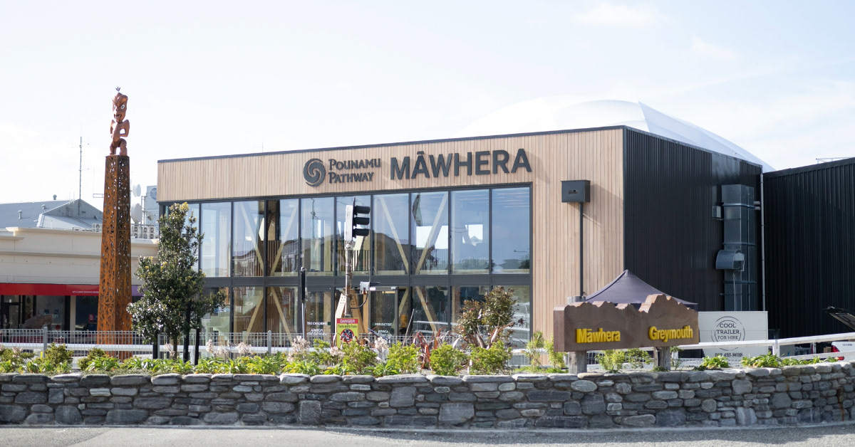
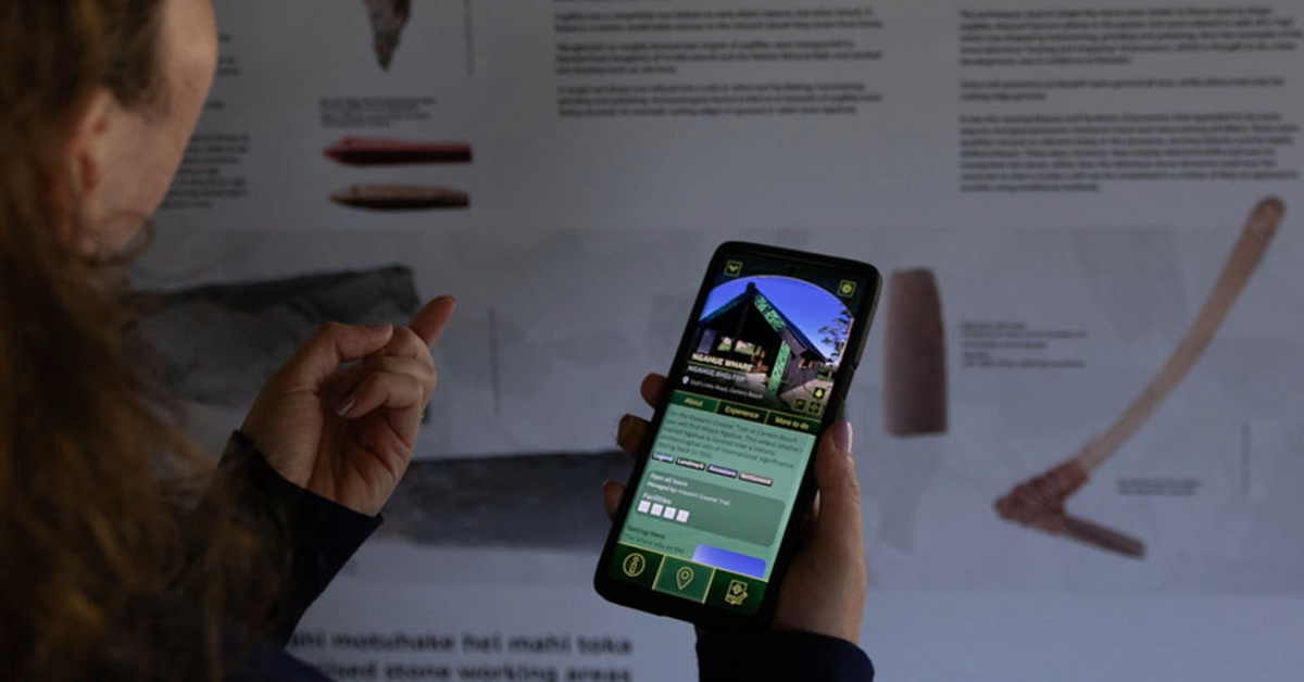
Pounamu Pathway is an immersive AR navigation and exploration mobile app designed to guide adventurers and visitors through the West Coast of New Zealand’s South Island. It offers a game-like experience to uncover heritage artifacts, attractions, and hidden gems, aiming to boost the region's popularity and educate international visitors about its rich history. Additionally, the app features the Māwhera Pā Pounamu Hunt, an exclusive AR experience that becomes accessible only when visiting the Māwhera Greymouth Centre.


My Responsibilities
I joined Pounamu Pathway project during it later production stages and as part of my work I had to revise the existing app, find accessibility and user experience issues and suggest the improvements.
Additionally to that I have:
- Maintained new user and competitive research, that included analyses of the pain points and wider target audience
- Optimised existing design system and developed Figma structure for the new one, include reusable components
- Led couple of user play tests and analysed the results
- Led the update of UI elements to improve readability and reduce the amount of unnecessary assets
- Designed new features that increased the UX
- Redesigned existing main pages and created light theme
UX Review of the existing app
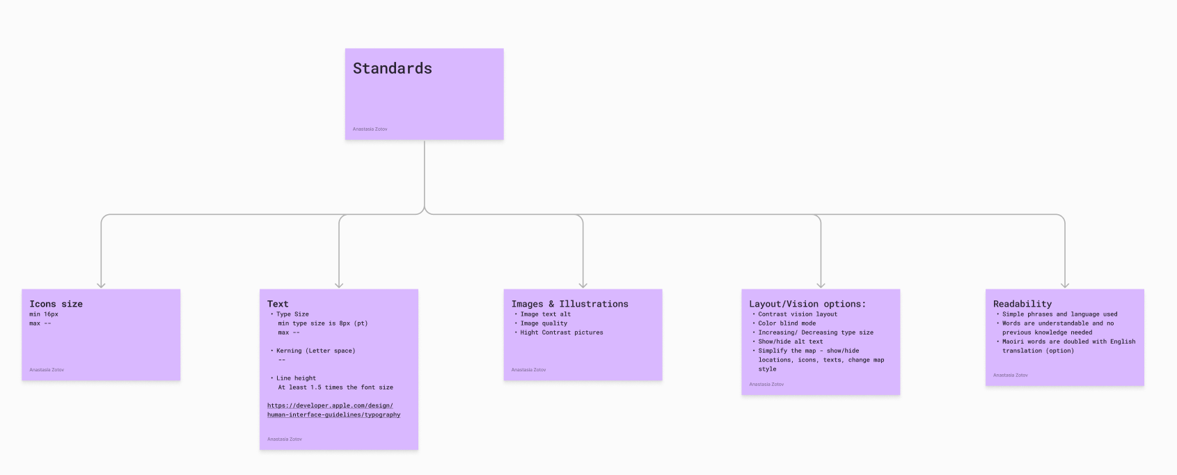
I began my work on the project by reviewing the existing product and identifying imperfections and potential UX issues. To ensure my feedback was well-based, I conducted extensive user research that included a broader target audience and New Zealand's accessibility standards.
From my findings, I categorized the project goals into MVP levels:
1. Basic app functionality, including a map.
2. Additional features, such as quizzes and path creation, among others.
1. Basic app functionality, including a map.
2. Additional features, such as quizzes and path creation, among others.
Using this research, I created a persona profile to better understand user limitations and how they might interact with the app. This perspective was invaluable in shaping the design.
I compiled a detailed report of my analysis, which sparked productive discussions with the team and led to a prioritized list of improvements that we could implement effectively.



User flows
Based on my research and insights, I developed user flows aligned with the expectations a user might have. Some of these flows were on a a competitive analysis conducted during the research phase, ensuring the app’s functionality matched anticipated user behaviors for a seamless experience. Subsequently, I created a detailed Information Architecture list, which helped refine the app's hierarchy to make it more intuitive and aligned with user expectations.

User flow

Information Architecture
Design system
The app lacked consistency in its colors and typography, with redundant UI assets contributing to cluttered and hard-to-follow screens. To address this, I defined an optimised color palette, established typography scales and typeface usage across the app, and developed a grid system for all screen types. Additionally, I created a reusable Figma component library, streamlining the design process for mockups in later stages.
FTUE
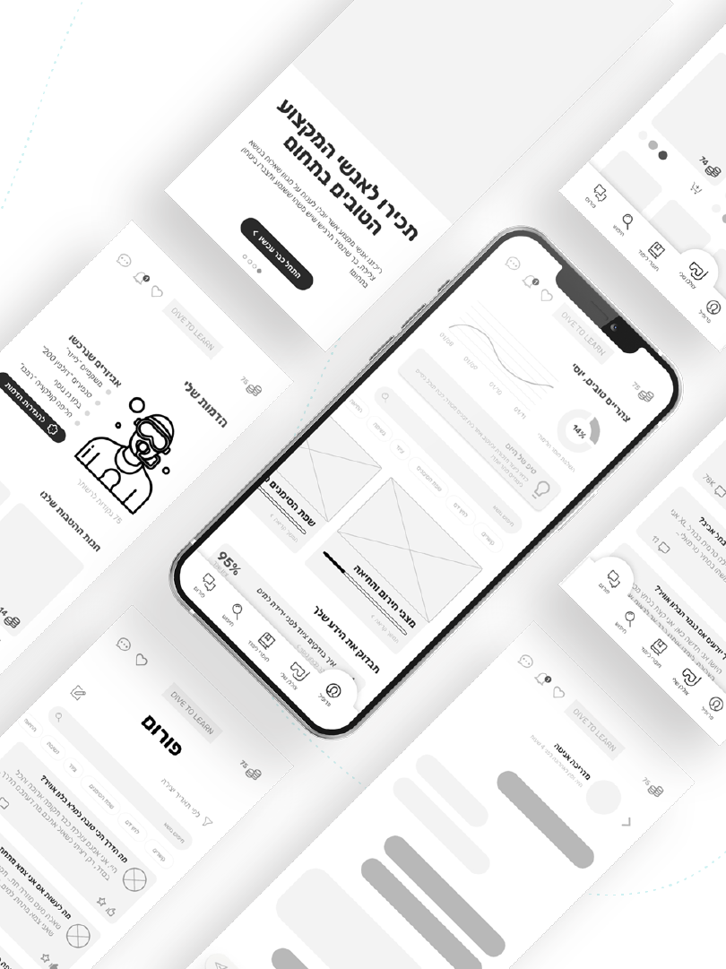
The existing onboarding flow was cluttered and lacked visual hierarchy, causing users to struggle with following it and often skipping it entirely. To improve engagement, I introduced pagination, simplifying the content into concise, focused messages complemented by appealing visuals. I began by capturing screenshots of the current screens, creating wireframes, and redesigning them with clear alignment to our goals.
Main app design
The main user flows of the app were revisited and simplified to ensure they were more user-friendly. I also proposed a couple of new features that could enhance the app's gamification and overall usability. For instance, adding a scoring system for quizzes and a competitive feature allowing users to challenge others could encourage more participation in quizzes, helping users learn more about the locations described and expanding their knowledge. Another suggestion was to introduce a light theme, making the app easier to use in direct sunlight, as we anticipated users would often access it during hikes. Unfortunately, these ideas were not included in the final release but might be considered for future updates.

The final design updates implemented in the app include:
- Button Redesign: Introduced a clear visual hierarchy with primary, secondary, and tertiary buttons, each featuring distinct states.
- Optimized Sizes: Adjusted button, icon, and typography sizes for better usability on mobile screens.
- Main Screen Enhancements: The bottom menu received a creative update, thanks to our talented artist, and a small New Zealand map was added to indicate the user’s current view. Map filter tags were also redesigned for improved usability.
- Updated Location Screen: Improved readability by incorporating section separations and adding icons.
- Simplified Copy: Texts were revised and rephrased to ensure straightforward communication and an easy reading experience for users.
- Many more.
FTUE prototype
